google ad sense 728 x 90

The Perfectly Powerful Peanut Expressed in 12 New Ads From The National Peanut Board.


A new print, online and transit campaign by Atlanta ad agency Lawler Ballard Van Durand for the National Peanut Board combines the people photography of Chris Crisman with botanical illustrations by Wendy Hollender and Rose Pellicano.

Hand Cut Illuminated Paper Art by Hari & Deepti


hari & deepti hero IIHIH

Harikrishan Panicker and Deepti Nair, who both hail from India, go by the duo artist name of Hari & Deepti. Together they create small and large diorama artworks made of intricately cut layered paper lit by LED lights.

Tree of Light, unlit and lit:
tree of life unlit and lit IIHIH
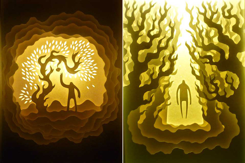
Spirit of the Forest (lit and unlit):
Spirit of the forest (lit and unlit) IIHIH
The Protector (lit and unlit):
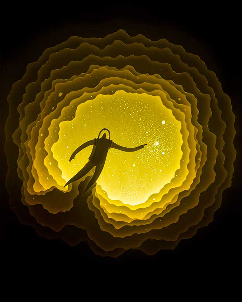
The protector (lit and unlit) IIHIH
Spacedust:
spacedust IIHIH
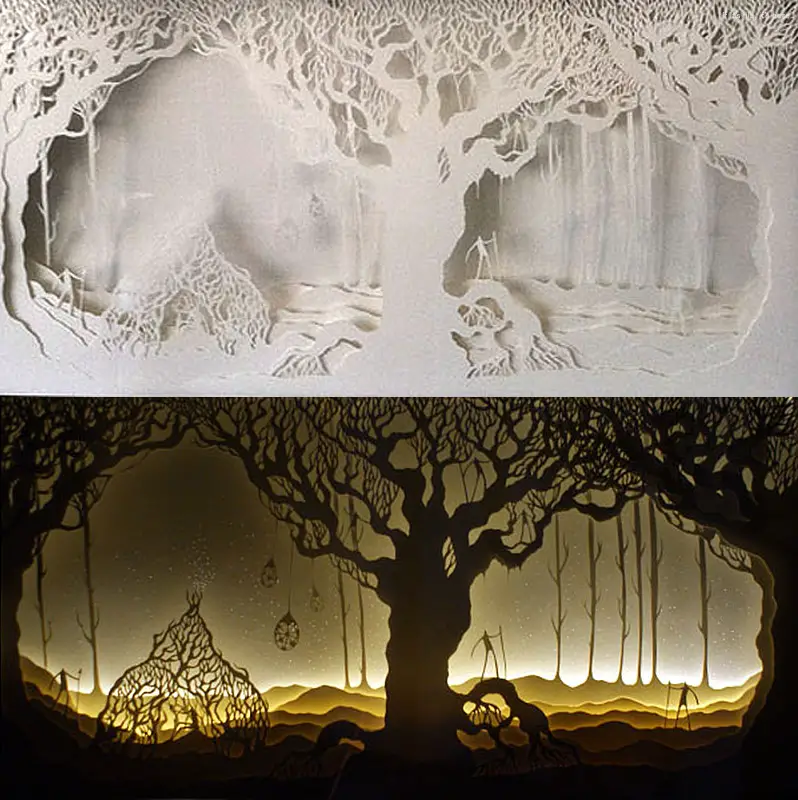
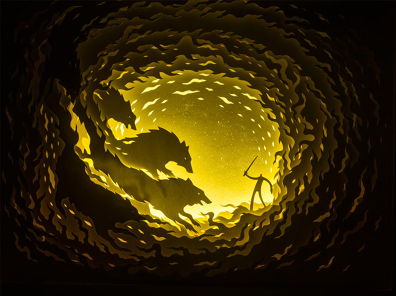
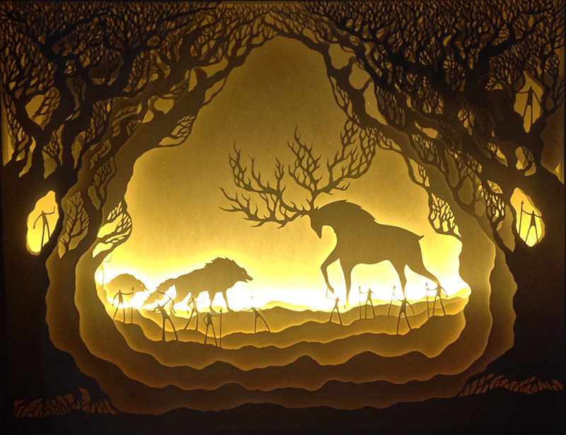
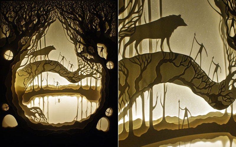
Fire Wolves and the Lone Warrior:
fire wolves and the lone warrior IIHIH
When Life Gives You Lemons (left) and Where I Belong (right):
when life gives you lemons and where I belong IIHIH
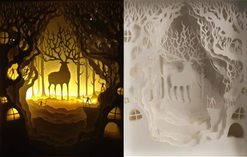
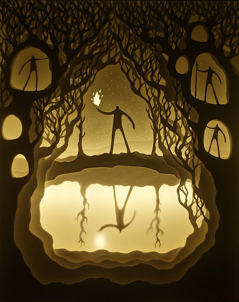
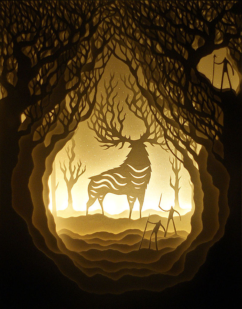
The Light in the Forest:
the light in the forest IIHIH
Utopia:
utopia IIHIH
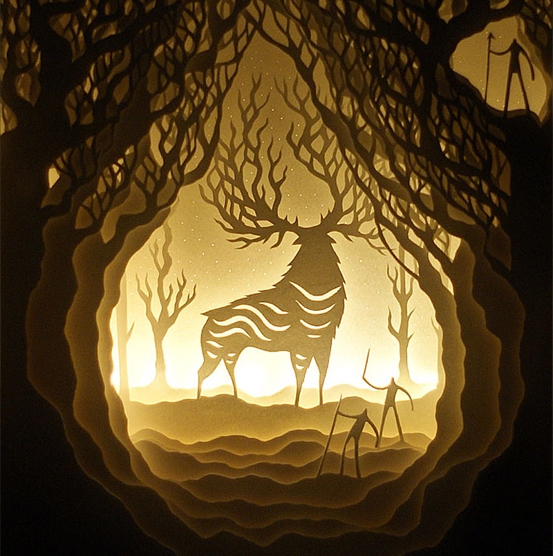
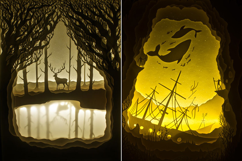
The Golden Stag (left) and Uncharted Waters (right):
the golden stag and uncharted waters IIHIH
When The Dust Settles:
when the dust settles IIHIH
Moonlight Drowns Out All But The Brightest Stars:
moonlight drown out all but the brightest stars IIHIH
The Protector 3 (and detail):
The protector3 and detail IIHIH
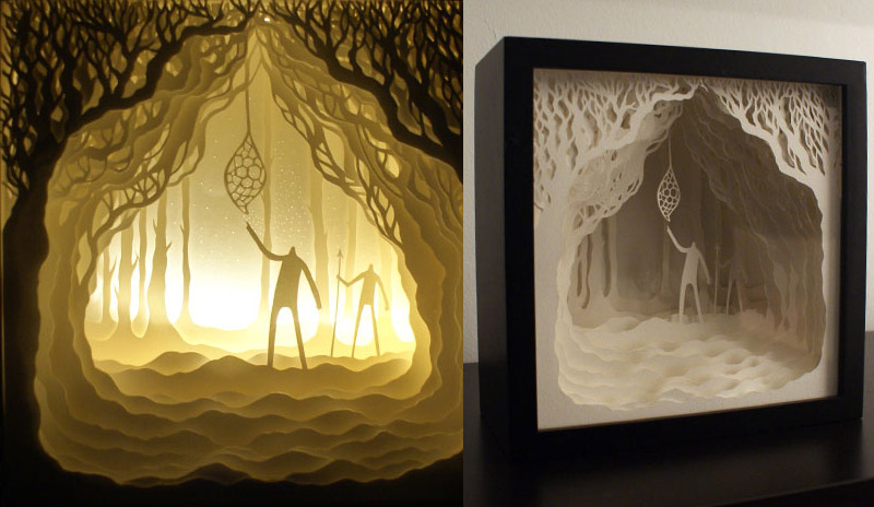
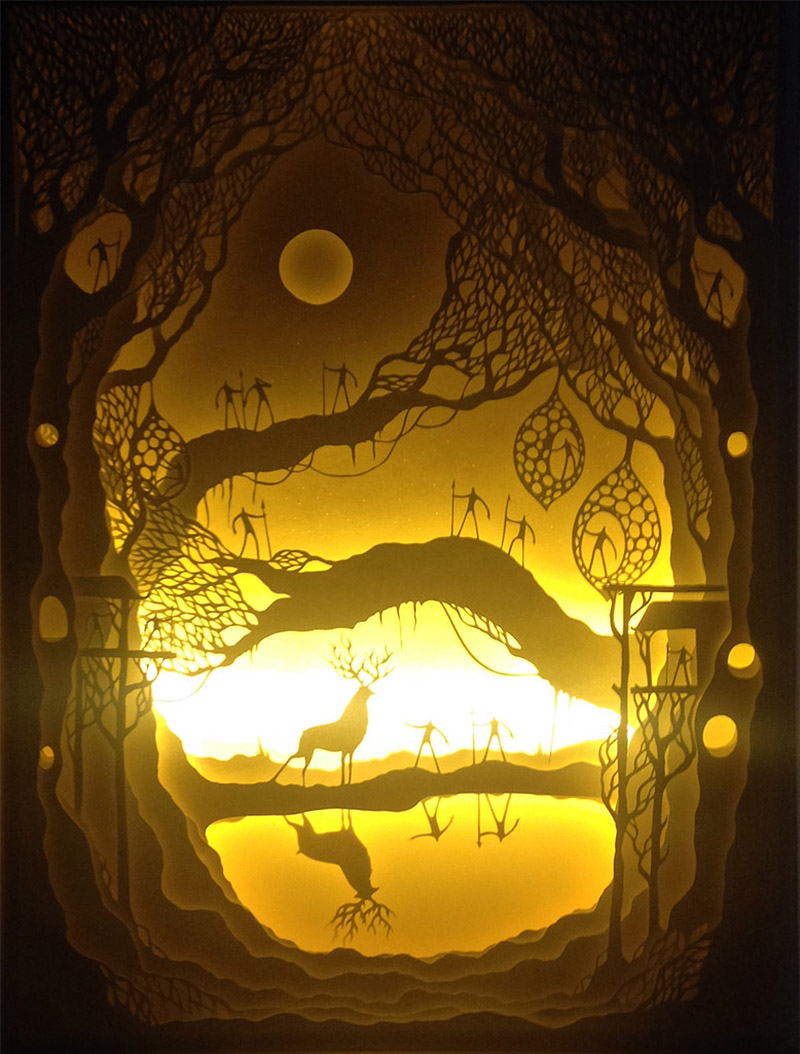
The Illuminated One (also shown cropped at the top of this post):
the illuminated one IIHIH

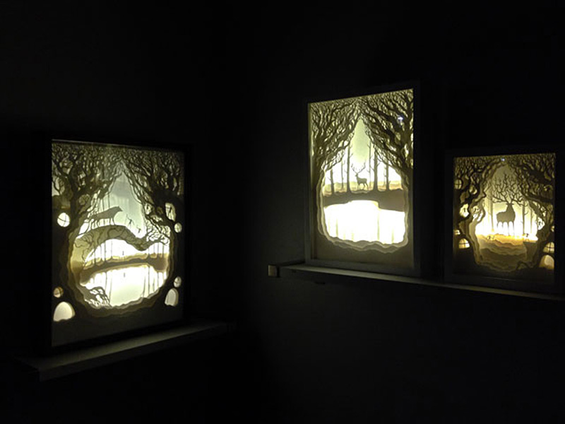
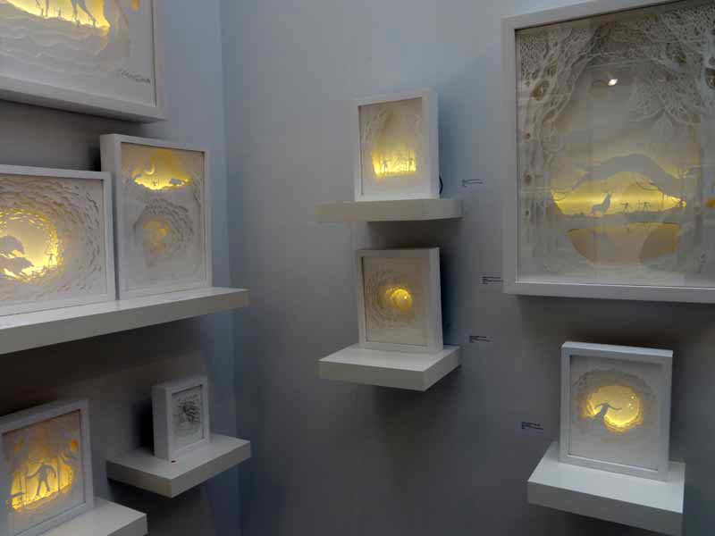
Artworks as they appear in Galleries:
luminous beings gallery view IIHIH hari and deepti gallery view

About the artists:
Hari & Deepti are an artist couple currently based out of Denver, Colorado.

Hari (whose full name is Harikrishnan Panicker) is a trained graphic designer and illustrator. He was born and raised in Mumbai, India where he was the senior designer for MTV Networks India and has designed for brands like MTV India, VH1 India, Nickelodeon & Comedy Central. Apart from designing for these brands, he is also an established illustrator and has designed album covers for musicians like Dualist Inquiry and has been invited to design a cover for Rolling Stone India for their annual – Art as Cover Edition. He loves to collect and customize vinyl toys, is obsessed with drawing monsters, loves to screen print & secretly aspires to be in space some day. He fell in love with paper cut art after seeing Balinese shadow puppets and has since been experimenting with paper and light.

Deepti Nair is a certified geek and is usually seen designing complex systems for a leading Telecom company as an Interaction Designer. “My day job helps me keep sane and makes me appreciate the time and opportunity I get to create art a lot more” says Deepti. She is a trained artist and prefers staying away from the computer to create or assist in her art. She believes that art has to be felt and experienced. She specializes in working with paper cut, acrylic and loves sculpting with clay.

Hari & Deepti moved to Denver from India and carried with them a Pandora box full of stories and imagination that they bring to life through their intricate paper cut light boxes and paper clay sculptures. They have always been drawn towards the imaginative aspect of story telling and seek inspiration from them. Stories have so many shades and depth in them, and paper as a medium has the exact qualities to reflect and interpret them. They believe that “Paper is brutal in its simplicity as a medium. It demands the attention of the artist while it provides the softness they need to mold it in to something beautiful. It is playful, light, colorless and colorful. It is minimal and intricate. It reflects light, creates depth and illusions in a way that it takes the artist through a journey with limitless possibilities.”

They started experimenting with paper cut shadow boxes in 2010 with hand painted watercolor paper which was then cut and assembled in a wooden box to create a diorama, with years of practice their art became more intricate and minimal at the same time. They started experimenting with lights and simplified their pieces by losing the colored aspect of the paper. They have since then evolved to add their own style of paper cut art incorporating back-lit light boxes using flexible LED strip lights.

“What amazes us about the paper cut light boxes is the dichotomy of the piece in its lit and unlit state, the contrast is so stark that it has this mystical effect on the viewers.”

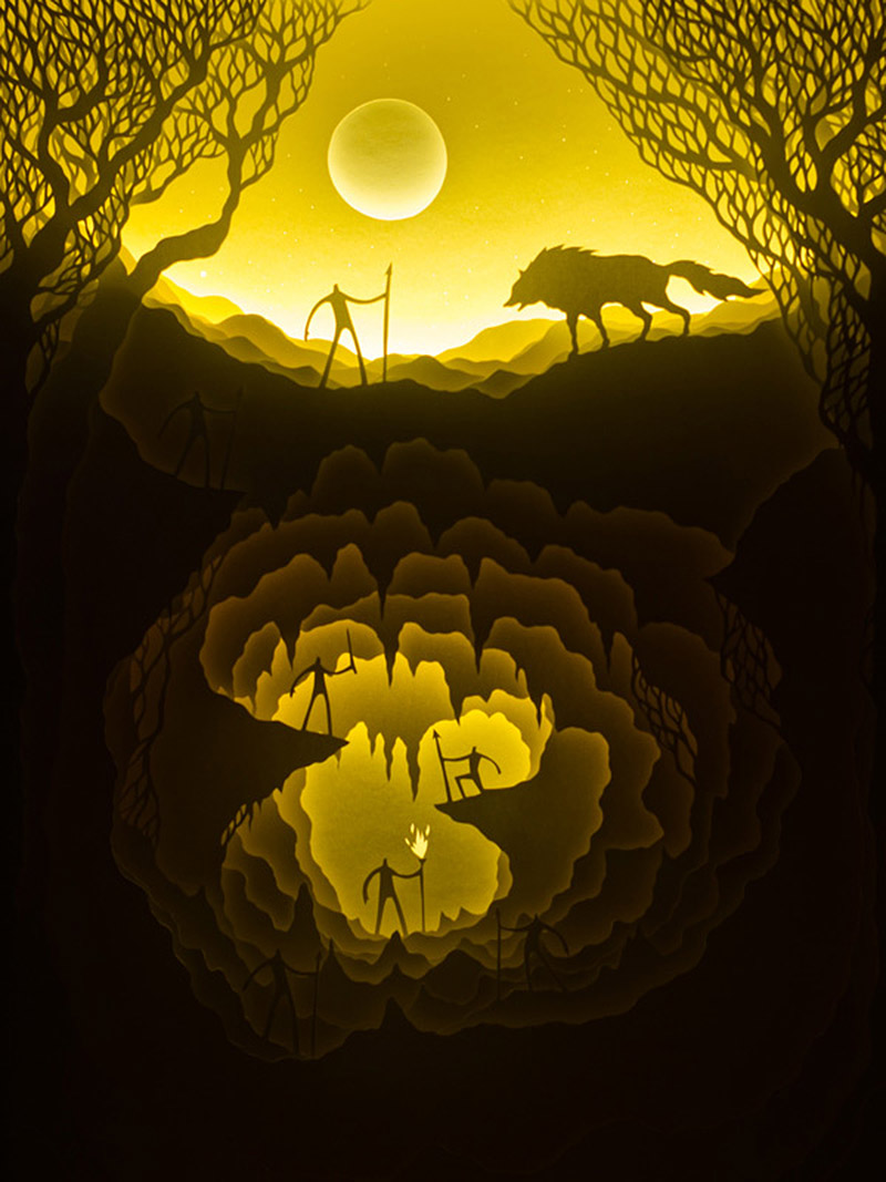
They are constantly evolving their art with more complex representation of stories and aspects, like reflections in the water.

See more of their work here

images and info courtesy of The Black Book

Kit Kat's Tribute To Lego


Kit Kat continues to engage people and set social media sites abuzz with their fun guerilla marketing projects. Their latest is a tribute to Lego. They created their own unofficial Lego Kit Kat kit, if you will, to encourage people to "Build Their Own Break"- a play on the candy's long time tagline. The boxed set is numbered 27325 and has been named #LEGOKITKAT.


Kit Kat Lego 3 IIHIH

Yesterday, they sent the following press release to Lego brick fans and sites:
Here at KIT KAT we are huge fans of LEGO. Because nobody is better at building a great break than LEGO, except for us maybe. So during one of our occupational breaks we came up with the idea of a KIT KAT entirely made of LEGO bricks.

We call the result simply #LegoKITKAT and it comes with a lot of authentic details: the KIT KAT logo, a red wrapper, four chocolate fingers, layers of wafer and even a snapping sound when you break it! And even though we don´t really expect #LegoKITKAT to hit the shops anytime soon, we gave it a stylish box anyway. But the best bit about it: everyone can build his very own perfect break from it. Introducing Lego KIT KAT with more than 1 million in 1 breaks.

Go build your own break – A tribute to Lego. Have a break, have a Lego KIT KAT.


all images courtesy of Kit Kat

Credits:
Advertising Agency: JWT Group Germany, Frankfurt, Germany
Executive Creative Director: Mark Karatas
Copywriter: Carsten Bug
Junior Copywriter: Haiko Hörnig
Art Director: Kathrin Waschek
Junior Art Directors: Andreas Villing, Oliver Wohlfarth
Packaging Design: Heike Konsek
Account Manager: Alexander Hempel
Production: Fabian Schrader

Alas, My Knight In Shining Porcelain. Eleven Of Them.


11 suits of armor, each measuring 1.6 meters tall and made of transparent glazed porcelain, flank the public area of the Provincial building in Leeuwarden. Designed by Hans van Houwelingen in collaboration with Koninklijke Tichelaar Makkum who produced the pieces, the 11 porcelain knights were part of a triptych of works commissioned by The Province of Friesland whose common theme involves the relationship between art and politics at a time when they seem to be moving further and further apart. The project is named Mecenaat Provinsje Fryslãn.

Porcelain Knights hero IIHIH
Porcelain Knights9 IIHIH

In the public area of the new Provincial building eleven suits of white porcelain armor with closed visors stand proudly on eleven consoles. Stately, conservative, self-assured and fragile, each bears the coat of arms of a Frisian town on its cuirass.

Porcelain Knights3 IIHIHPorcelain Knights12 IIHIHPorcelain Knights11 IIHIHPorcelain Knights5 IIHIH

A suit of armor made of porcelain is like Frisian tradition, which preserves the people but at the same time makes them vulnerable. Tradition protects, but is also society's Achilles heel, just as porcelain can last a thousand years or be shattered by a single blow. Koninklijke Tichelaar Makkum produced the numerous components of these suits of armour.

Porcelain Knights4 IIHIH Porcelain Knights2 Porcelain Knights15 IIHIH

This commission has once again enabled Koninklijke Tichelaar Makkum to showcase its traditional craftsmanship and expertise in ceramics. Hans Van Houwelingen is quoted as saying “I am very impressed by Makkum's craftsmanship.”

Porcelain Knights14 IIHIH
above: Hans van Houwelingen inspects an actual suit of armor for inspiration

Creating and producing the pieces:
Porcelain Knights6 IIHIH
Porcelain Knights13 IIHIH
Porcelain Knights1
Porcelain Knights10 IIHIH
Porcelain Knights8 IIHIH

About Hans van Houwelingen
Hans van Houwelingen (1957) was educated at the Minerva Art Academy in Groningen (Netherlands) and at the Rijksakademie van Beeldende Kunsten in Amsterdam. His work is internationally manifested in the form of interventions in public space, exhibitions, lectures and publications, in which he investigates the relations between art, politics and ideology. He has created various exhibitions and permanent installations in public spaces. He publishes regularly in newspapers and magazines. The monograph Hans Van Houwelingen VS. Public Art: Stiff (Artimo, 2004) offers an overview of his projects and texts and an extensive reflection on his work. The publication update describes the permanent update of the Lorentzmonument in Arnhem (NL) during the exhibition Sonsbeek 2008. Hans van Houwelingen's Undone was published, presenting nine critical reflections on three recent works. Van Houwelingen lives and works in Amsterdam.

images courtesy of Hans van Houwelingen, Koninklijke Tichelaar Makkum and Vormen uit Vuur

Please donate

C'mon people, it's only a dollar.